For the Love of Colour: The Politics of Minimalism and Maximalism
by Amreen Pathan in Culture & Lifestyle on 12th February, 2026

The calmest room I know is not white.
It is a room bursting with objects that know my story. A red tasbeeh, gifted by my sister, lies casually beside my husband’s — darker, heavier — their wooden beads catching the light in different ways. An open rail of clothes lines the wall: bright colours which I wear because they fill me with joy. There are vibrant books housed temporarily in cardboard boxes, and others rising in unsteady stacks, teetering across available surfaces. On the windowsill sits a candle, an assortment of body creams and a starfish mug: gifts from my Year 9s at the end of the school year — objects made sacred by the hands that chose them. A cushion I have stolen from my mum’s, rests where my head falls at night. I like the way it yields, familiar and soft, carrying the weight of another home into mine. The wallpaper is patterned, and it clashes with the flamboyantly coloured and patterned rug. Nothing here is resolved or harmonious. But it is evidence of a life that lives well, and lives in technicolour, not in white.
It is a curious thing, then, that while my peace lives among objects and colour, calm is so often marketed to us as the absence of both.
Pantone has named “Cloud Dancer” its Colour of the Year 2026 — a luminous white intended, they say, to offer relief from the “cacophony” of modern life and enhance focus while quieting distraction. A “blank canvas,” intended to offend no one.
In a world that is chaotic and loud, white is sold as clarity and calm.
But whiteness has never been neutral. And a blank canvas can never truly be empty of meaning. For a canvas to be legible as a neutral, it must first be stripped of texture, memory, preferences and particularities. This is precisely the world Cloud Dancer imagines and the many worlds it excludes.
The logic is simple. Cloud Dancer is white, stark, sterile and minimal. This assumes a kind of life most people do not actually live: spacious homes, uncluttered rooms and of course, the time and resources to curate and to pare back.
For most of us, homes are smaller, messier, shared, and shaped by necessity as much as taste. Our spaces hold our evidence of living: children, elders, work, memory, culture and even faith.
To then present this idea of whiteness as aspirationally calm is unrealistic and evasive. The world as we know it is tumultuous beyond belief. Yet rather than acknowledging that reality, Cloud Dancer proposes retreat: a withdrawal from complexity rather than an engagement with it. The implication here is that neutrality is not just soothing but morally superior. White is disciplined and reasonable, while colour becomes indulgent, unruly and excessive.
We see this logic everywhere: institutions and brands insisting on neutrality while continuing business as usual, issuing statements stripped of colour, conviction or consequence. In realities where genocide is livestreamed, borders are violently enforced, and dissent increasingly criminalised, remaining neutral is a performance in its own right — one that masks complicity, all the while siding with systems of power.
What reads as aesthetic preference is therefore deeply ideological. It is a demand for palatability and neutrality that often functions as an erasure of the many ways people live, gather and make meaning in space. What is framed as universally calm is, in fact, calibrated around specific bodies, aesthetics and ways of living, typically those already closest to institutional power.
Colour as Resistance
Encouragingly, this framing of white as clarity and calm is far from uncontested. Across contemporary politics and grassroots movements alive, colour is mobilised as a refusal of neutrality and an insistence on visibility in spaces that equate ‘civilisation’ with neutrality.
This is evident in what is, admittedly, one of the most compelling political campaigns of recent years: Zohran Mamdani’s mayoral run. The campaign’s visual language stands in stark contrast to the muted palettes of institutional politics. Electric blues, punctuated with yellows and oranges, sit alongside handwritten typography that echoes both New York neighbourhood signage and South Asian poster traditions. The effect is one of accessibility: a politics that invites participation and connection and rejects bureaucratic neutrality.
Elsewhere, colour has been used even more explicitly as resistance. In northern India, the Gulabi Gang — an all-women vigilante group fighting domestic violence and corruption — are instantly recognisable by their vivid pink saris. Pink, a colour often trivialised or dismissed as feminised, is repurposed to signal collective power and women’s agency. Visibility, in this context, is as much about solidarity as it is about protest, as pink becomes a shared language of recognition and support.
Colour has also played an active role in Dalit activism. Dalits, historically positioned at the bottom of India’s caste hierarchy and subjected to centuries of exclusion and violence, have deployed blue as a political symbol of liberation from caste oppression. Drawn from the image of an open, non-discriminatory sky under which all stand equally, blue rejects the inherited ideology of caste oppression. Its significance is inseparable from Bhimrao Ramji Ambedkara, a lifelong advocate for Dalit rights, who is frequently memorialised in a blue suit. This is a deliberate defiance of caste restrictions that once dictated how Dalits were permitted to dress.
Yet its history also reveals tension: the same colour that signifies empowerment has, at times, been imposed to mark and single out Dalit communities. In the mid-1990s, policies introduced by the Bharatiya Janata Party (BJP), a right-wing Hindu nationalist party in India, required Dalit schoolchildren in parts of Maharashtra to wear blue uniforms, transforming a symbol of empowerment into a means of identification and control. Blue, in this instance, operates as a symbol that holds both resistance and the ongoing struggle over visibility.
More recently still, the colours of the Palestinian flag — red, green, black and white — are read as an explicit political declaration, standing in for Palestinian existence itself.
To display, or even acknowledge, the colours of the Palestinian flag is to acknowledge Palestinian peoplehood, historical continuity and a narrative outside of systematic powers invested in their erasure.
Here, colour does more than just represent identity; it helps safeguard it, carrying memory and struggle where all other forms of recognition are denied.
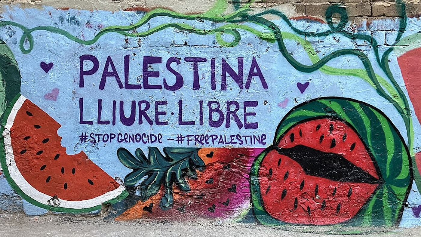
Taken together, these examples make clear that colour is not neutral. It carries histories of struggle, resistance and refusal, marking who is seen and who is allowed to take up space. In contrast to the promise of white as calm and clarity, colour insists that lives and cultures cannot, and will not, be simplified away.
Not Just a Modern Day Story
If colour appears so carefully controlled, that is only because the ideas that seek to discipline it are much older. Colour as excessive, loud or disorderly didn’t begin with Pantone or contemporary aesthetic discourse. To understand why whiteness continues to be sold as clarity and civilisation, we have to look at where this thinking first took hold.
One of its clearest expressions appears in the work of Adolf Loos, whose 1908 essay Ornament and Crime helped shape modernist minimalism. Loos imagined a future where cities would “glisten like white walls,” a moment he described as fulfilment. For him, progress meant subtraction: fewer patterns, fewer colours, fewer distractions. Ornament was not simply unnecessary; it was a sign of cultural failure.
What matters here is not just Loos’s dislike of decoration, but what he attached it to. He repeatedly linked ornamentation to primitivism, drawing a clear line between what he considered civilised and what he did not.
White, restrained, and undecorated spaces were framed as modern and advanced. Colour and ornament, by contrast, were categorised as backward, irrational and uncivilised.
This discomfort with colour has a name: chromophobia. Literally, it refers to an intense or irrational fear of colour. In a cultural sense, however, it describes a broader pattern.
As David Batchelor argues in his frequently cited book Chromophobia, Western thought has long treated colour as something to distrust or diminish, repeatedly framing it as vulgar, feminine, or merely superficial rather than an expression of emotion, history and culture. This logic did not belong to any single thinker or period. Long before Loos, Johann Wolfgang von Goethe claimed that “savage nations, uneducated people, and children” were particularly drawn to vivid colours, while those who delighted in richly decorated dress were likened to fairground monkeys.
These are not throwaway insults. They reveal a worldview in which colour is associated with immaturity and vulgarity, while whiteness is presented as intelligence, discipline, and moral superiority. Together, these ideas form a powerful cultural script of hierarchy.
The same ideology that governs colour also governs how abundance is perceived. Maximalism — an extension of colour into homes, objects, architecture and daily life — has also long been framed as excess when it appears outside the West. Yet colour, ornament and abundance have always existed within Western societies too. What differs is not the presence of maximalism, but how it is named and who is allowed to claim it.
Western Maximalism

The Victorian era offers a telling example. Often remembered as the height of British opulence, it was also the height of the British Empire. The lavish interiors, heavy drapery, patterned wallpapers, and richly coloured furnishings that defined Victorian homes did not materialise benignly. They were built through extraction.
Chintz textiles and paisley patterns, canopied and four-poster beds, cane and rattan furniture, exotic floral and animal motifs, and Indian decorative objects and curios, such as brassware and lacquerware, were lifted from, inspired by, or derived through Britain’s colonised territories and rearranged into domestic spaces that functioned as private museums of conquest. Colour and ornamentation became proof of dominion, accepted only when caged behind glass or carved into furniture but never lived in, never worn, cooked with or claimed by the people it was taken from.
In this context, Western maximalism was not excess born from sentiments of anxiety or soul; it was an expression of power — excess born of plunder.
The story of Bengal muslin makes this painfully clear. For centuries, Bengali weavers produced muslin so fine it was described as woven air. It was worn locally, traded widely, and embedded in everyday life. Under British rule, however, this industry was systematically dismantled through punitive taxation, forced monopolies, and the flooding of markets with British industrial cloth. What remains today is the object without its world: muslin preserved in museums like the Victoria and Albert Museum, fetishised in portraits of the empire, yet stripped of the hands and bodies that once wore and wove it.

A similar story unfolds across much of the African continent. From richly patterned textiles like kente and mudcloth to carved masks, beadwork, architecture, and ceremonial dress, African societies have long expressed meaning, lineage, and social order through layered visual language. Under European imperialism, these aesthetics were frequently looted and then displayed as artefacts — admired for form while emptied of function. What was once lived, worn and inhabited was reclassified as primitive art, valuable only once removed from African bodies and homes. Again, maximalism was tolerated only when frozen in time and placed behind glass.
This logic becomes painfully concrete in the story of the Bangwa Queen. Carved by the Bangwa people of what is now Cameroon, the wooden sculpture represents a royal female figure of deep spiritual and cultural significance, embedded in systems of ritual and ancestral continuity. Looted during the colonial era, the Queen now lies captive in Europe, held by the Dapper Foundation in Paris. Having passed through the global art market for millions, her value has been affirmed not through belonging but through price. What remains is a sacred figure severed from the community that gave it meaning — an ornament prized precisely because it was stolen, and because it could be sold.
These examples expose the glaring contradiction in Western frameworks of taste. What presents itself as taste or aesthetic judgement is never neutral. Minimalism grows out of ideas about order, purity, and hierarchy, by people who get to decide what is tasteful and acceptable.
Maximalism, on the other hand, is permitted only once it has been removed from the people who live it, stripped of its living culture and converted into something that can be priced and sold. Empire, upholstered.
Reclaiming Lived Maximalism
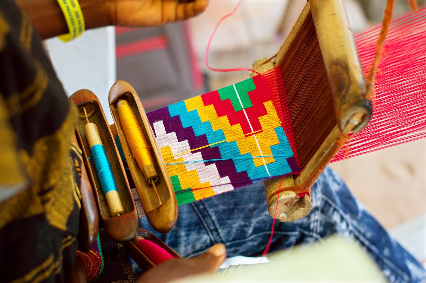
Our maximalism is something else entirely; it is lived, not purchased.
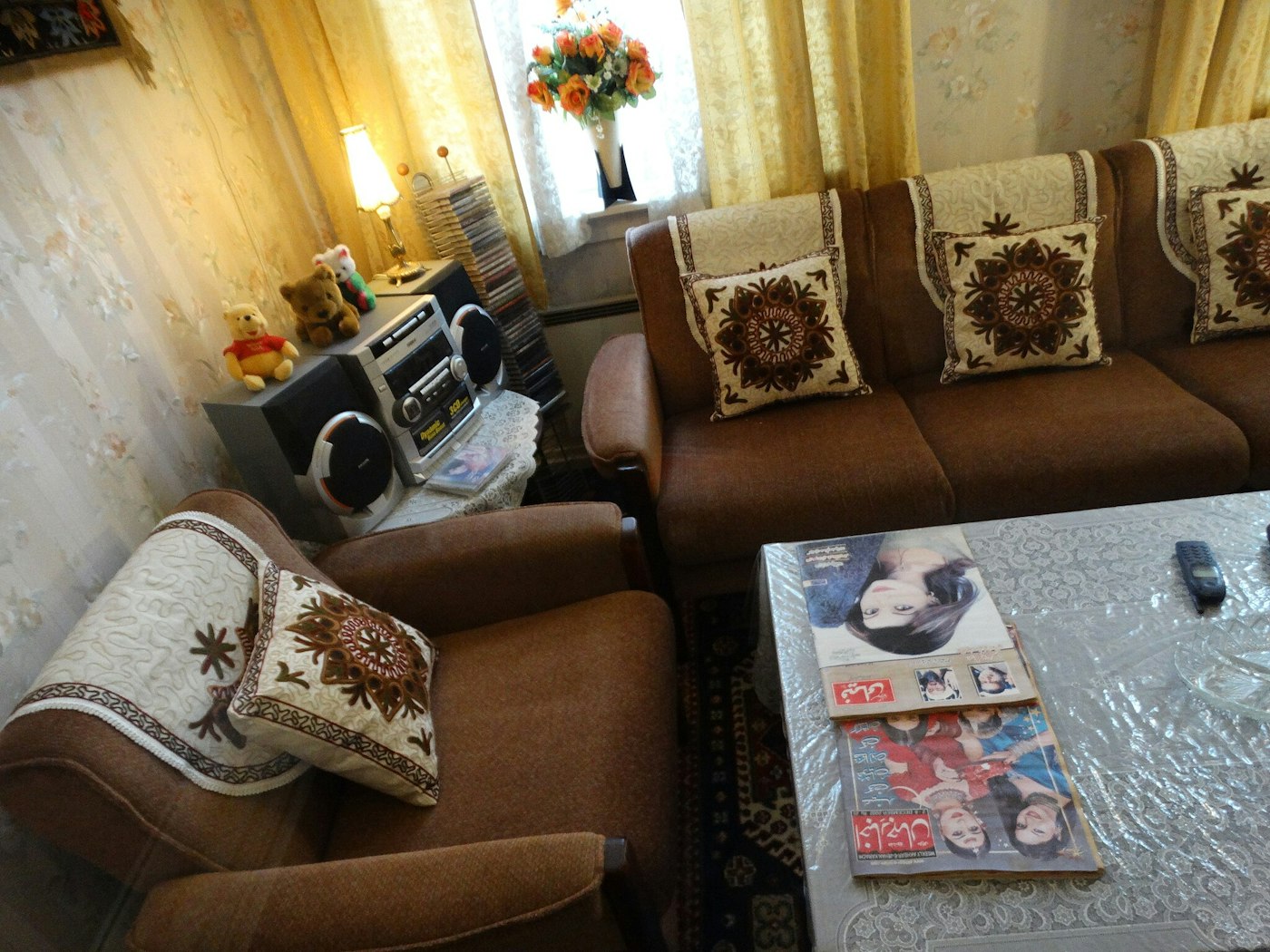
In South Asian homes — whether rooted in ancestral land or carried into diaspora — colour and maximalism are not a design choice but a way of being. They show up in prayer corners and seating arrangements, in camel-coloured blankets and calligraphy, in incense burners and recycled plastic containers, in old family photographs with patterned sofas in the background. They live in spice tins and thaali plates, in henna cones tucked into fridge doors, in homes designed to hold many bodies, many moments, many memories.
Food follows the same logic. Plates are crowded with colour, spice, and texture, where abundance signals care rather than indulgence, and sharing is an expression of community rather than excess.
Homes and souls bursting with knick-knacks and sentiment.

This is true across much of the Global South. In African homes, too, colour and ornament are not design choices but inheritances. They appear in vibrantly coloured cloths wrapped around bodies for significant life moments, from burial shrouds used in funeral rituals to garments symbolising lineage and social identity, in calabashes and carved stools used daily rather than displayed, and in walls painted or patterned to mark lineage and belonging. Homes are arranged for communal life for elders, children, ritual and care, where objects accumulate meaning through use and memory. This is not maximalism as excess but as belief and history and survival.

When viewed through a Western modernist lens, this way of living is rarely afforded this generosity of interpretation. Maximalist homes are often dismissed as cluttered and tasteless, as they don’t align with elite design aesthetics or don’t belong to the wealthy. But what is dismissed as clutter is, in fact, ritual — culturally, religiously or spiritually. What is framed as excess is sentimental. What is labelled tasteless is often deeply relational.
Maximalism in both colour and ornamentation, for us, is not a trend to follow or a mood to adopt. It is a generous, lived chaos that requires no permission to survive. To embrace it is not to consume more, but to notice what is already there.
The white walls Loos imagined promised fulfilment through subtraction, a future scrubbed clean of colour, ornament and attachment. But that kind of calm requires forgetting. It asks us to forget where objects come from and how they arrived in our homes and museums; who is permitted to accumulate and be called cultivated, and who is instructed to pare back and be grateful. It forgets which lives are allowed to leave traces and take up space and which are deemed too uncultivated, too excessive, too disorderly to be held at all.
Perhaps the work, then, is not to choose between restraint and abundance, between colour or a lack of it, but to reckon with the histories that shaped them — the harm as well as the beauty — and to refuse the narrative that neutrality is the same as peace. Calm, after all, has never meant absence. It has always been relational: something made through memory, ritual and presence.
Loos may have been waiting for fulfilment in white walls. We can find it instead in spaces, in chosen forms of expression — of mind, body and of home — that are inhabited full of colour, memory, and the simple refusal to be simplified.
References
- The ancient fabric that no one knows how to make – BBC Future
- The Colors of Zohran Mamdani in New York – Graphéine, l’agence branding qui soigne votre identité de marque !
- Banda sisters | Women | The Guardian
- Loos.pdf
- Motivation
- Pantone Colour of the Year 2026
- How Minimalism and White Supremacist Ideology Are Connected – TITLE MAG
- “Maximalism is a manifestation of a desire for a different world”
- The Logic of More: The Evolution of Maximalism in India | Branding in Asia
- “We must confront design’s colonial inheritance”
- Cloth in African history: the manufacture, patterning and embroidering of Africa’s signature textiles
- Smarthistory – Adinkra cloth
- Reinventing Resistance: The Ndebele Tribe’s Geometric Wall Art – ELEPHANT
- Chromophobia → David Batchelor
- From ‘untouchable’ to architect of India’s constitution: film tells story of Ambedkar | Global development | The Guardian
- The debt British interior design owes India | House & Garden
- The Bangwa Queen — The Loot Museum
- 10 Traditional African Outfits and What They Represent

Amreen Pathan
Amreen, 35, is an educator [English] in Gloucester and writer for Minara. Much to the dismay of her husband, she has an extreme preoccupation with collecting books. She rides horses and is perpetually starting a fashion blog in her own head which of course never materialises. She also dreams of living on a farm.